
Researching and Prioritising Self-Service Journeys
The Challenge
The existing customer portal offered limited support to users who wanted to manage their water matters independently. Navigation was fragmented, the dashboard contained little personal or relevant information, and frequently used tasks required an unnecessarily large number of steps.
The central design question was: How can we functionally and visually improve the existing customer dashboard while simultaneously creating a richer and more user-friendly self-service experience?
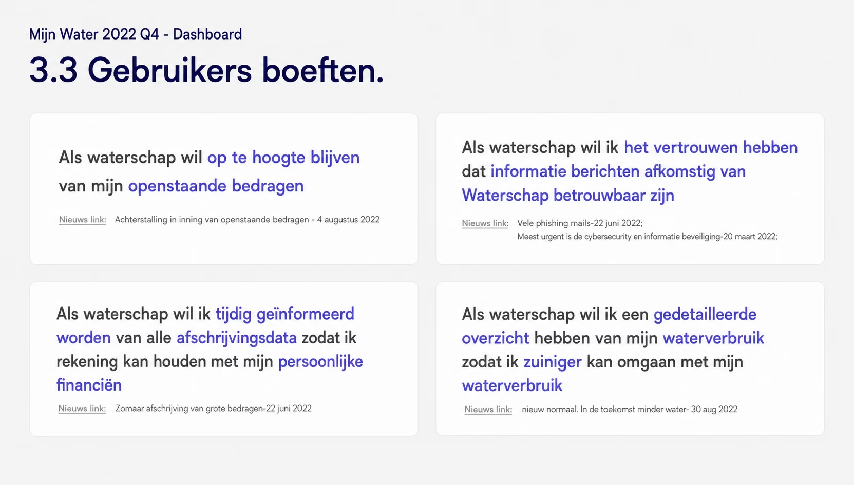
Before designing new solutions, we first needed to understand which customer journeys were most important, where users experienced friction, and how similar organisations approached digital self-service.
Because the portal supported many different services, it was essential to identify which experiences would have the greatest impact for both users and the organisation.
The Solution
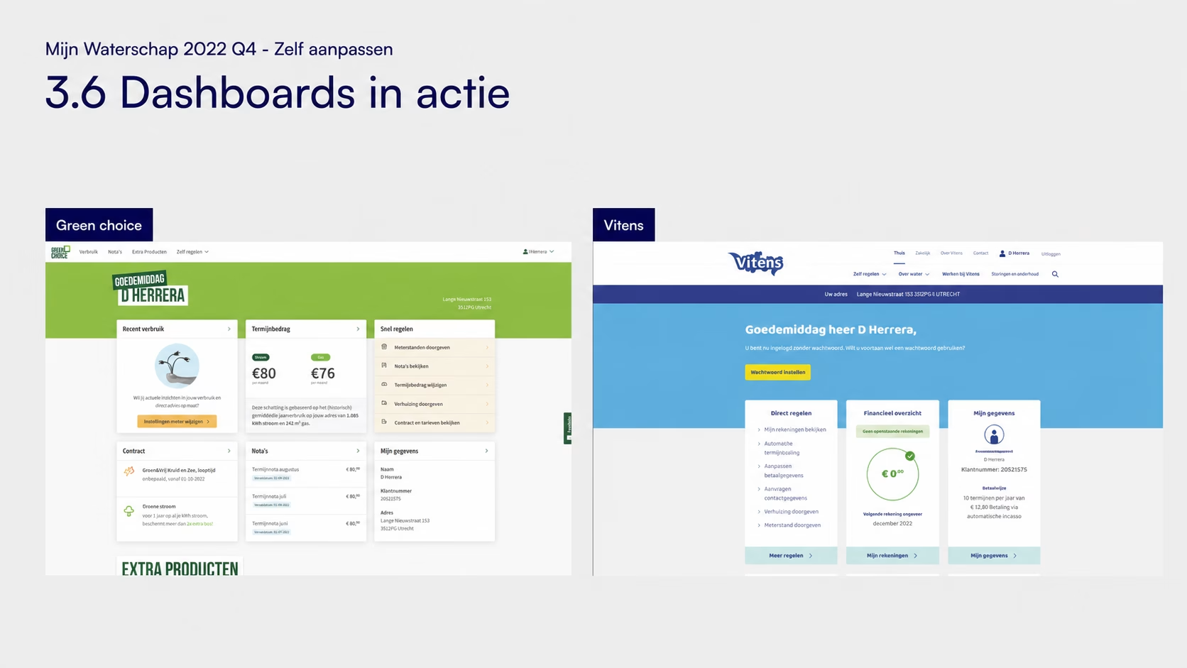
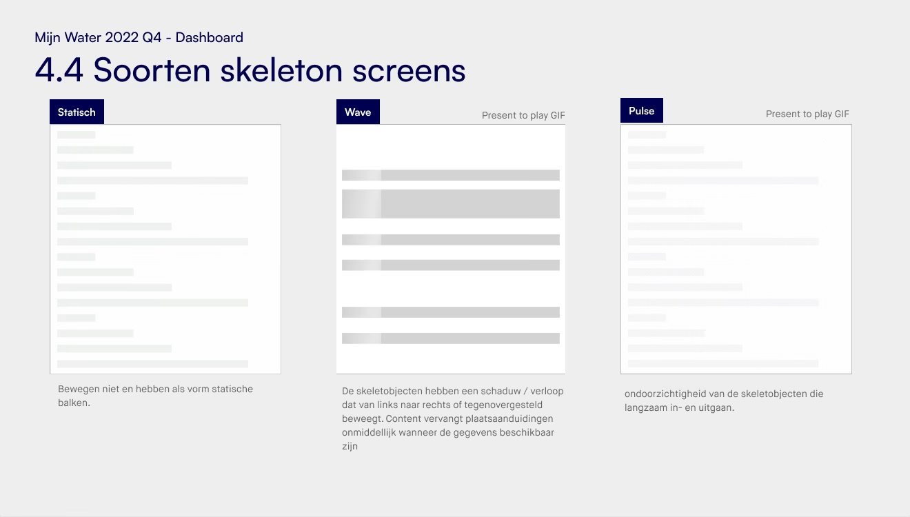
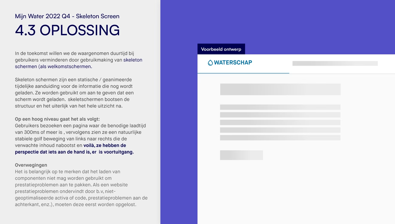
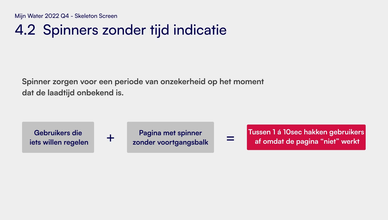
I conducted desk research and competitive analysis covering: - Dashboard design best practices - Digital self-service platforms - Authentication patterns - Loading states and skeleton screens - User journeys from comparable organisations
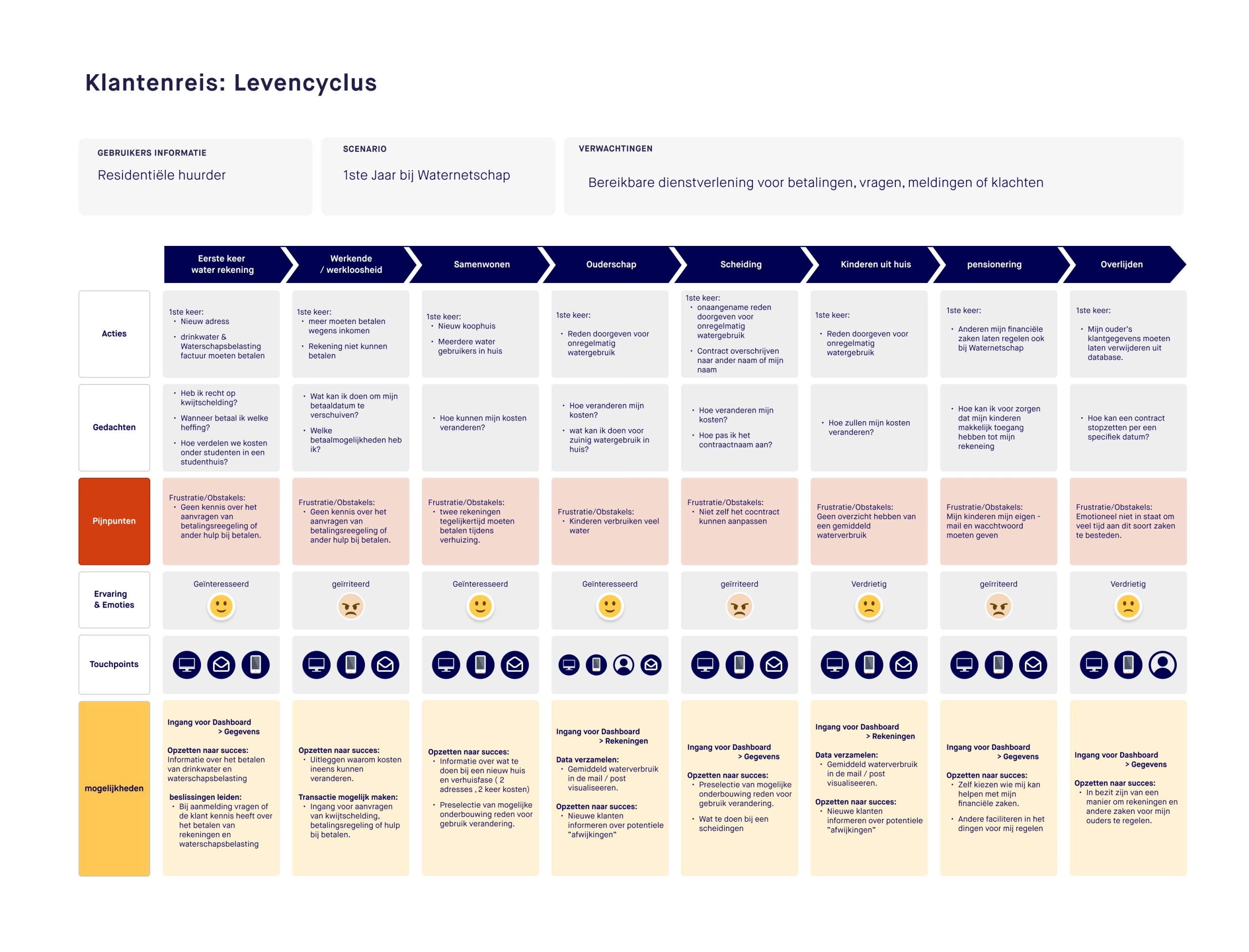
In addition, I created customer journeys for key services such as submitting meter readings, reporting a move and other common customer interactions.
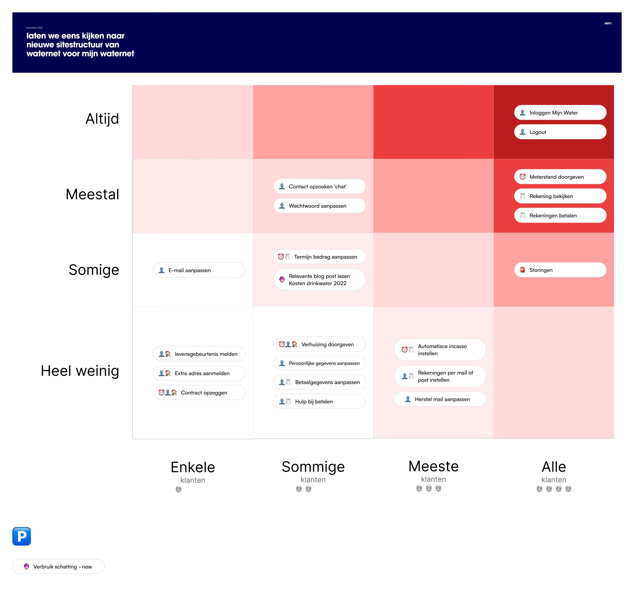
To help prioritise improvements, we analysed customer behaviour and applied the Red Routes methodology to identify the journeys that were both highly used and business-critical.
The research findings were consolidated into a UX proposal containing design principles, recommendations and a roadmap for future design work.
The Result
The research established a shared understanding across the project team and provided a clear foundation for design decisions.
By combining customer journeys, behavioural insights and Red Routes, we were able to focus the project on the experiences that would deliver the greatest value to customers.
Simplifying the Login Experience
The Challenge
Many customers visited the portal infrequently, making it difficult to remember their login credentials. The existing authentication process also contained several unnecessary steps and provided limited guidance when something went wrong.
The Solution
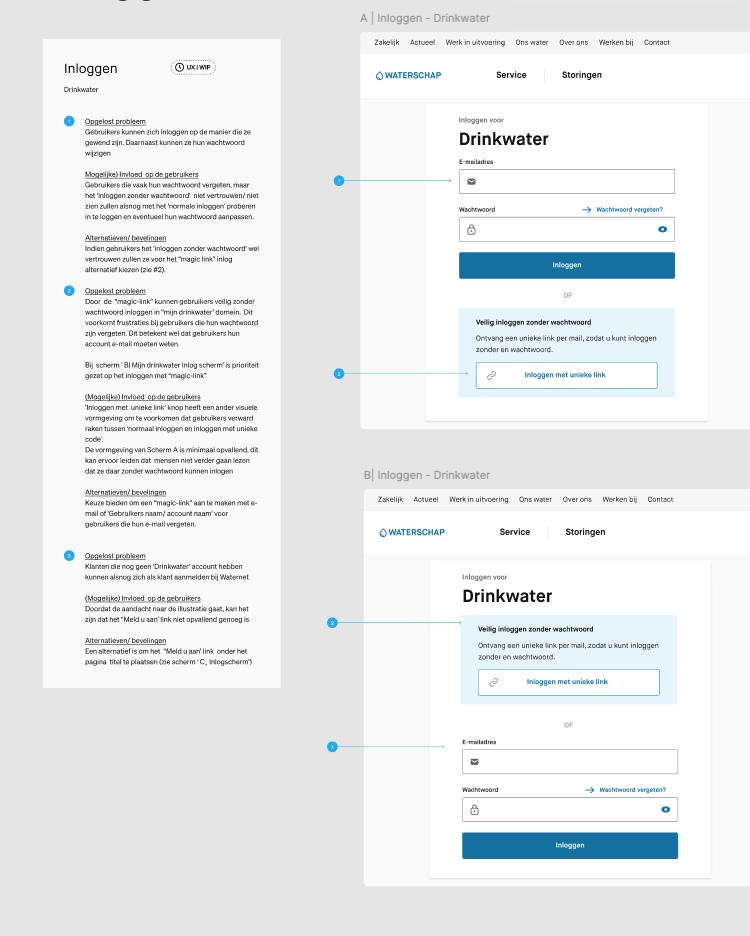
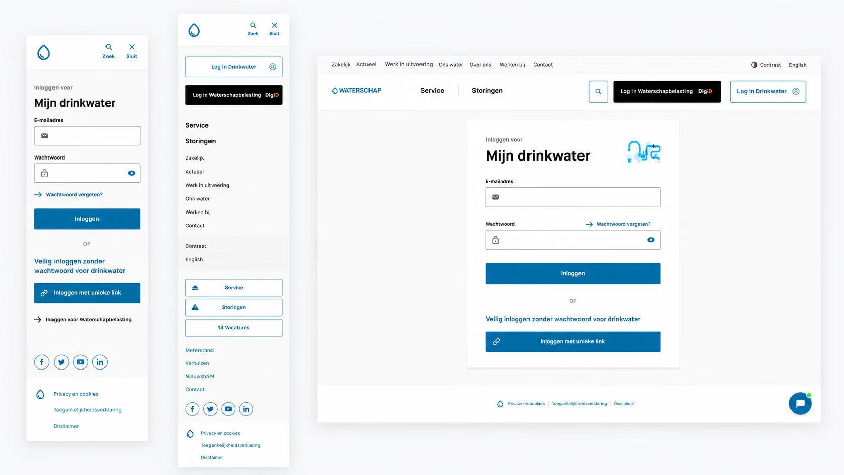
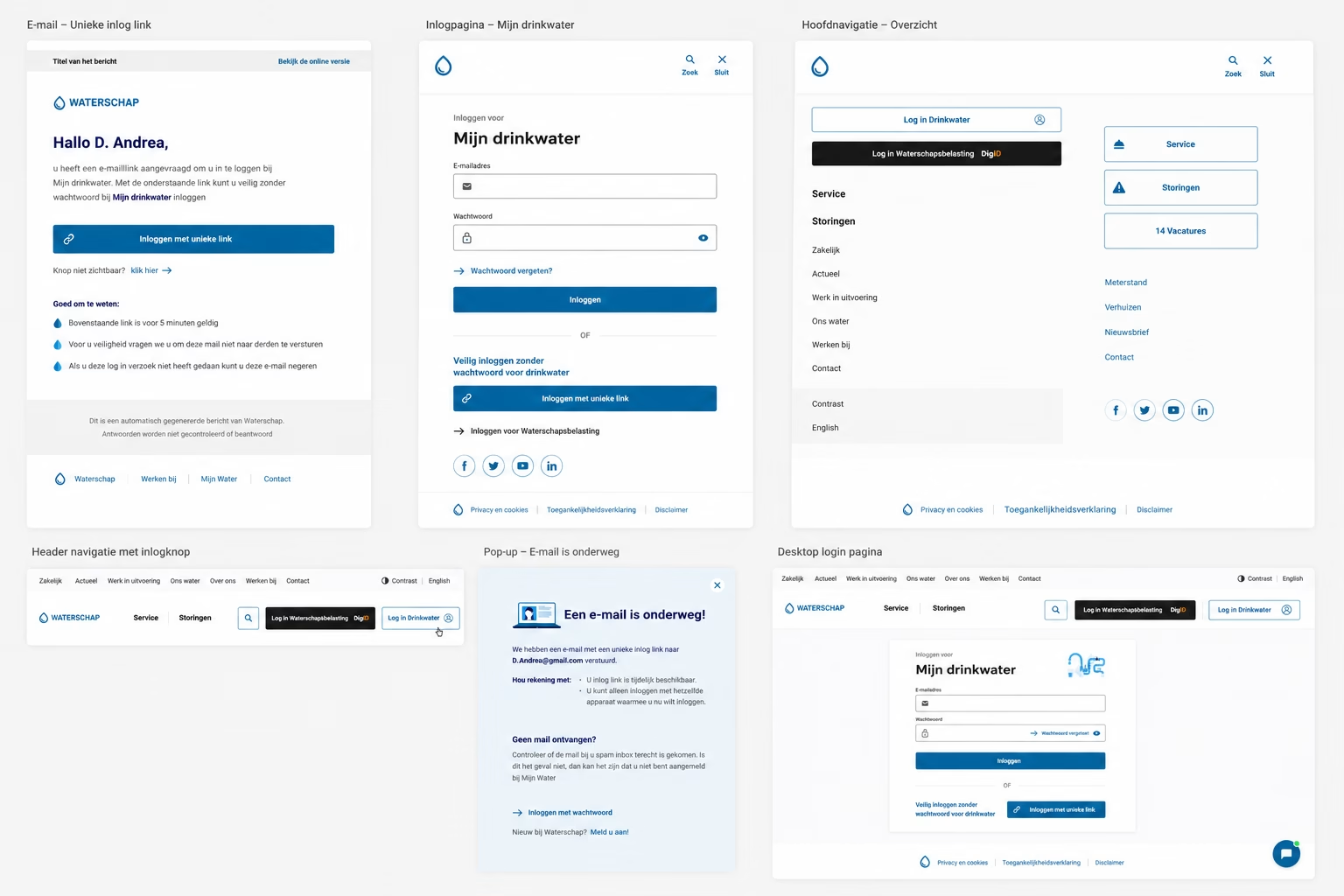
I explored alternative authentication methods and designed a passwordless login concept using Magic Links.
I created and prototyped multiple scenarios, including: - Successful login - Expired links - Invalid links - Opening a login link on another device - Error handling and recovery flows - The user journey after authentication
Each flow included concise design annotations describing: - The problem being solved - The expected user experience - Recommended interaction and feedback
Building interactive prototypes also allowed me to evaluate visibility, usability and flow logic throughout the experience.
The Result
The proposed concepts demonstrated how a simplified authentication flow could reduce friction while providing clearer guidance during both successful and unsuccessful login attempts.
Designing complete recovery scenarios also ensured the experience supported real-world user behaviour rather than only the ideal journey.
Creating a Smarter Customer Dashboard
The Challenge
The existing dashboard functioned primarily as a static overview and offered limited opportunities for customers to complete tasks directly. Information was not always grouped logically, and users frequently had to switch between different digital environments to manage related services.
The challenge was to introduce more self-service functionality while maintaining a clean and intuitive interface.
The Solution
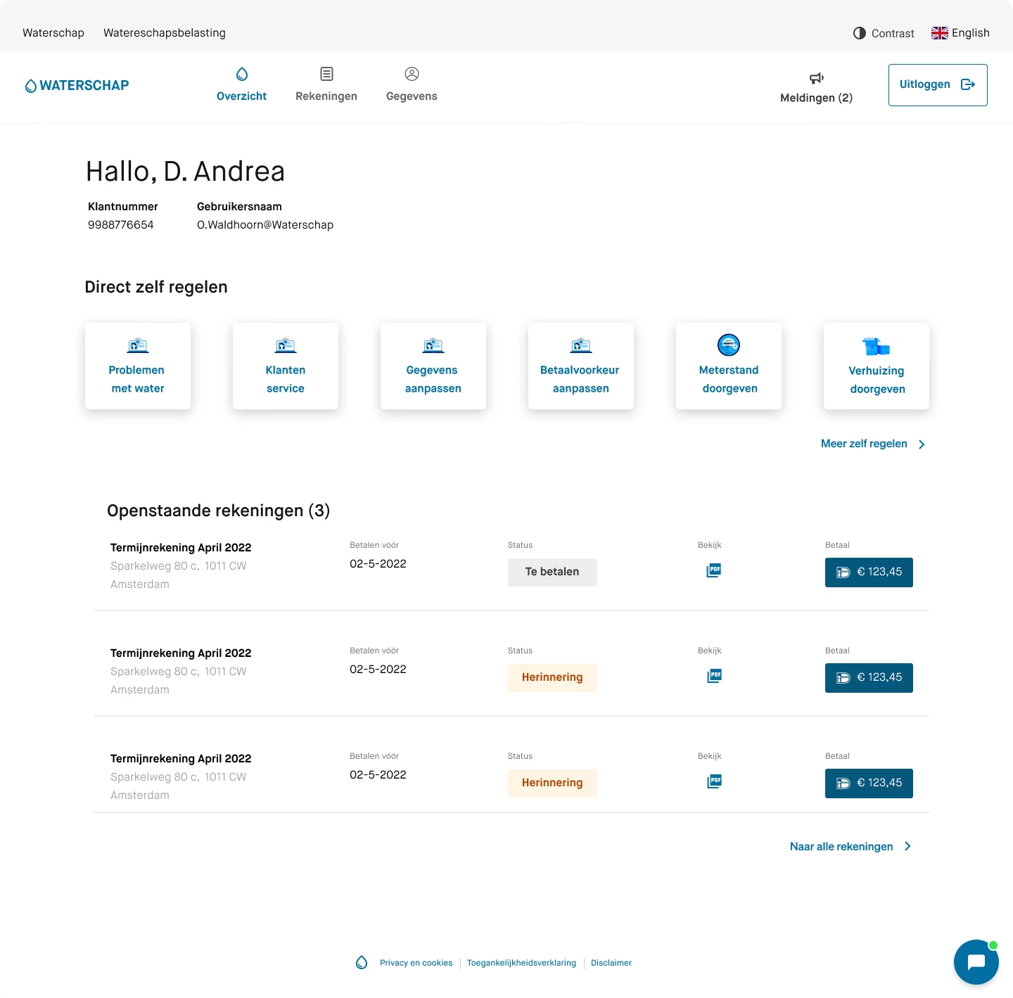
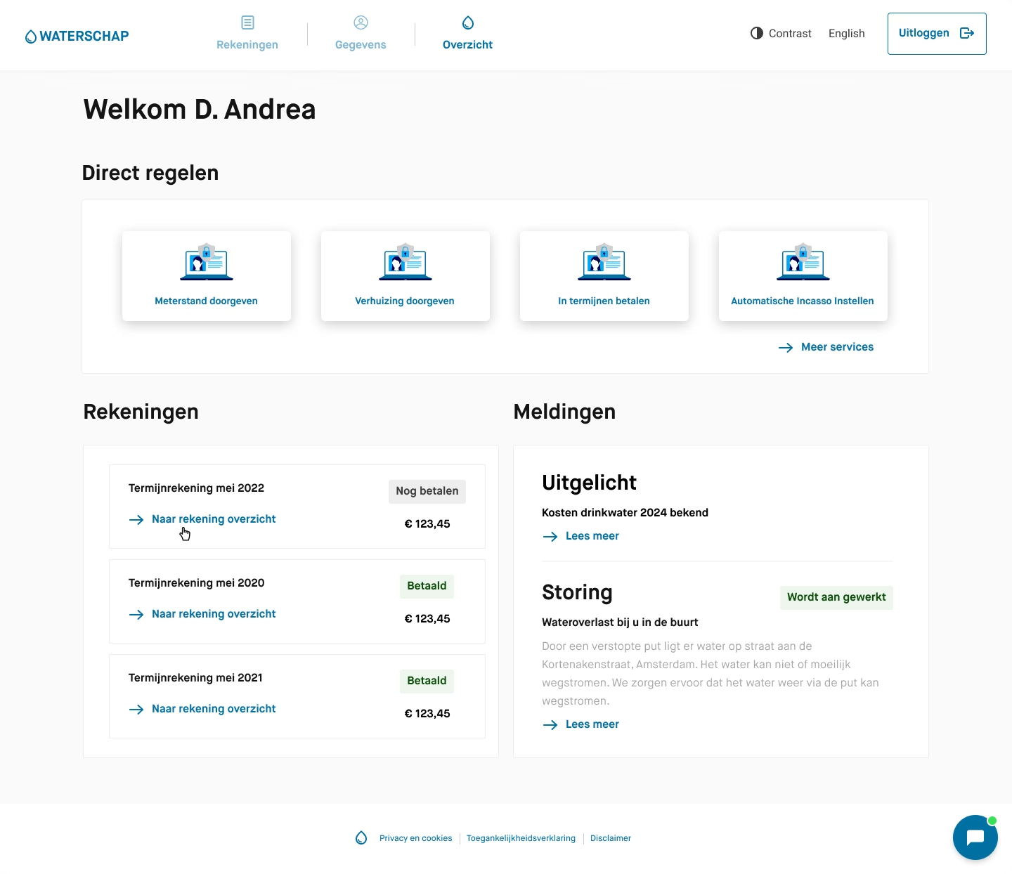
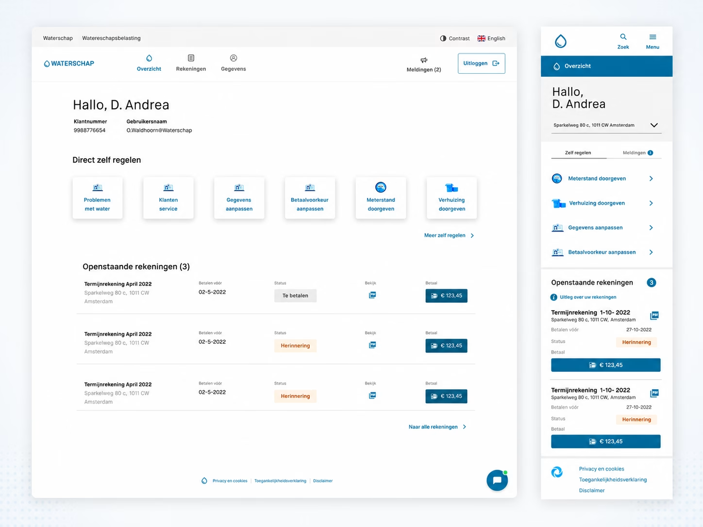
I designed multiple dashboard explorations focused on: - Information hierarchy - Grouping related services - Placement of primary call-to-actions - Direct access to frequently used services - Navigation between related digital environments - Responsive layouts for mobile devices
Alongside these explorations, I performed heuristic evaluations of the existing portal and identified usability issues such as:
- Unclear account settings - Unnecessary interaction steps - Inconsistent navigation - Missing links between related services - Accessibility improvements - Screens containing too much competing information
For each issue, I developed wireframes, interaction concepts and design recommendations.
Throughout several iterations, I simplified the interface by removing unnecessary information and giving greater visual priority to the most important customer actions.
The Result
The redesigned dashboard concepts made key services easier to find and reduced the complexity of common customer journeys.
Within the proposed experience, users could more easily: - Submit meter readings - Report a change of address - Manage personal account information - Navigate between related digital services
The iterative design process helped achieve a stronger balance between functionality, clarity and visual simplicity. El proceso iterativo me ayudó a encontrar un mejor equilibrio entre funcionalidad, claridad y tranquilidad visual. Het iteratieve proces hielp mij om een betere balans te vinden tussen functionaliteit, overzicht en visuele rust.
Reflection
This project taught me that simplifying a digital experience is often more challenging than adding new functionality.
Working with customer journeys, behavioural data and the Red Routes framework helped me better understand how to prioritise design decisions based on user needs and business goals. I also became much more aware of the importance of information hierarchy. A dashboard becomes more valuable not by showing more information, but by helping users quickly recognise what matters most and what action they should take next.
Beyond strengthening my skills in interaction design, prototyping and UX documentation, this experience taught me how to communicate design decisions effectively within a multidisciplinary product team and reinforced the importance of designing experiences that are both simple and meaningful.