
Evaluating the Existing Experience
The Challenge
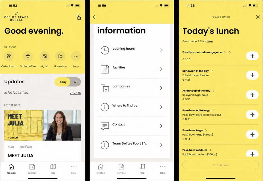
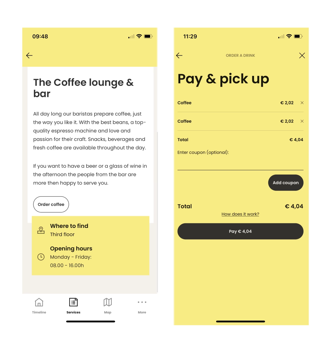
The existing application offered a wide range of workplace services, but many user journeys contained unnecessary steps, inconsistent interactions, and usability issues that reduced efficiency.
The redesign aimed to modernize the interface while preserving familiar workflows, allowing developers to focus on implementation without introducing unnecessary complexity.
The Solution
My first responsibility was conducting a complete UX review of the existing application.
I systematically reviewed every major navigation flow and feature to identify opportunities for improvement while documenting inconsistencies throughout the experience.
This process included reviewing flows such as: - Workplace services - Food ordering - User profile - Account management - Visitor invitations - Loyalty program - Notifications - Authentication - Password recovery - Account deletion
Through this audit I identified numerous usability issues that informed the redesign.
Some examples included: - Unnecessary intermediary screens before users could order services. - Shopping carts that automatically emptied after leaving a screen. - Missing communication options such as social media contact channels. - Broken account deletion links. - Confusing email confirmation messages that resembled phishing emails. - Duplicate actions during account verification.
The Result
The UX audit established a clear overview of improvement opportunities and became the foundation for several redesign decisions implemented in the final MVP.
Designing Better User Flows
The Challenge
The redesign required improvements without radically changing existing user behavior. The goal was to make the experience more intuitive while maintaining familiar navigation patterns.
The Solution
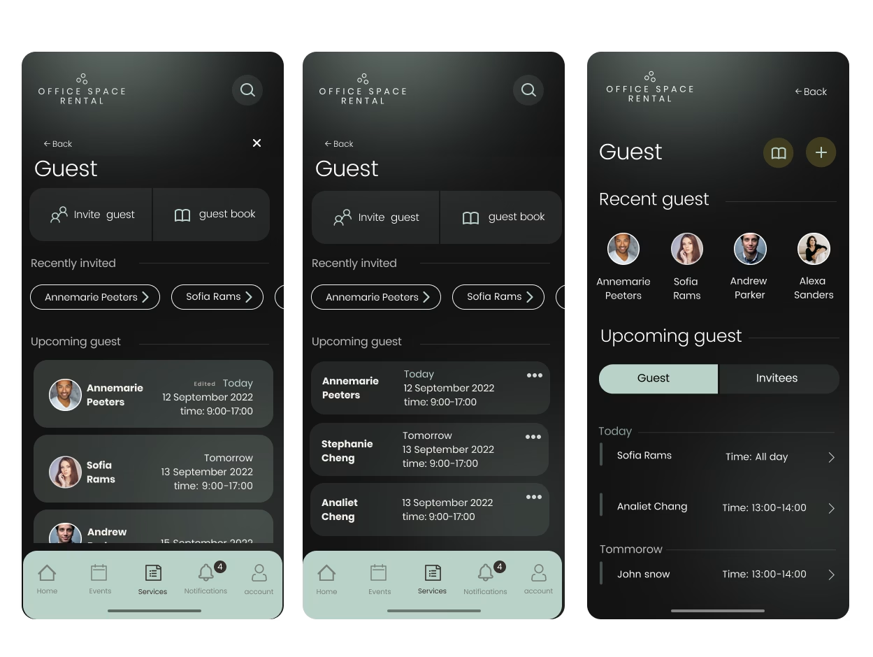
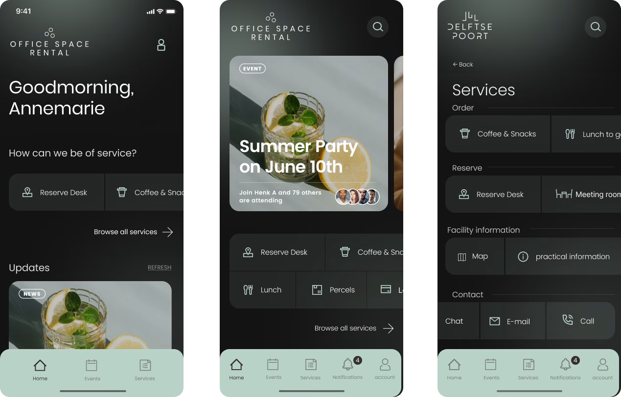
I was responsible for designing exploratory concepts for several key user journeys.
These included: - Services - User Profile - Visitor Invitations - Loyalty Program - Notifications - Empty States
Throughout the exploration phase I produced multiple design iterations, continuously refining layouts based on feedback from senior designers and stakeholders.
Many of these concepts were ultimately selected as the foundation for the final MVP.
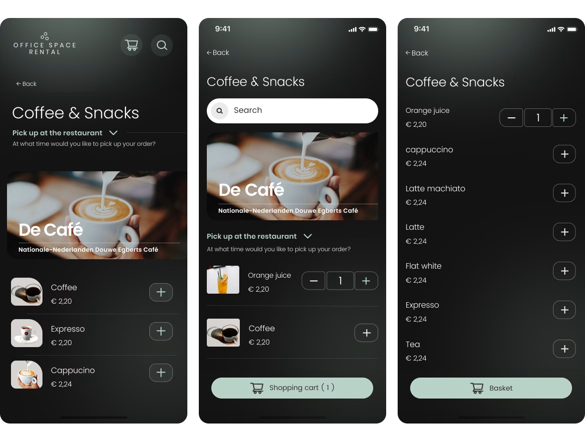
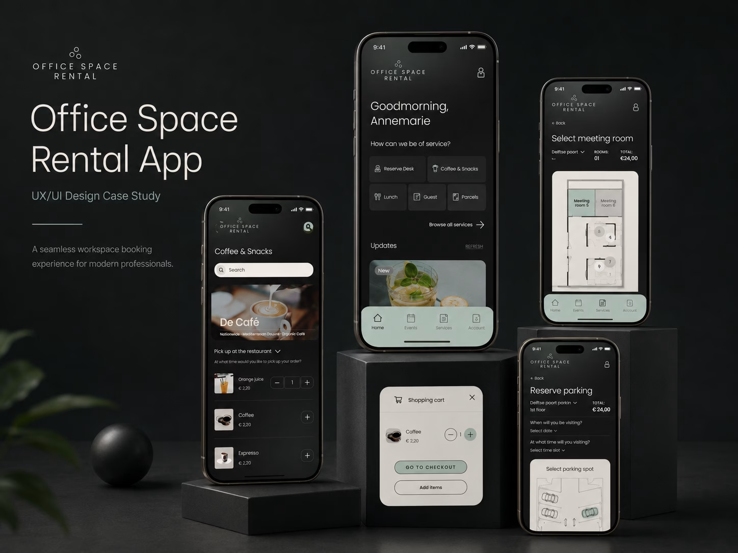
Some of the improvements I proposed included: - Removing unnecessary intermediary screens before ordering coffee and snacks. - Introducing a persistent floating shopping cart so users never lose their order. - Adding a dedicated contact section containing chat, email, phone and social channels. - Improving service categorization through clearer section headings. - Simplifying account management flows. - Redesigning password recovery emails to improve trust and brand consistency.
The Result
The redesigned user flows reduced unnecessary interactions, improved discoverability, and created a more seamless experience across the application.
Several of these concepts were adopted within the final product delivered by the design team.
From Concepts to MVP
The Challenge
Once the exploratory phase was completed, the focus shifted toward delivering a production-ready Minimum Viable Product.
The challenge was finding the right balance between improving usability while remaining close enough to the existing product for efficient development.
The Solution
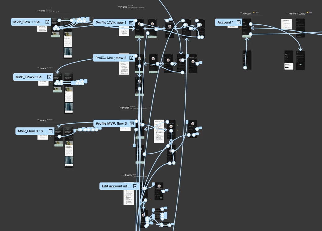
I reviewed every redesigned flow against the existing application to ensure visual consistency while identifying missing interactions.
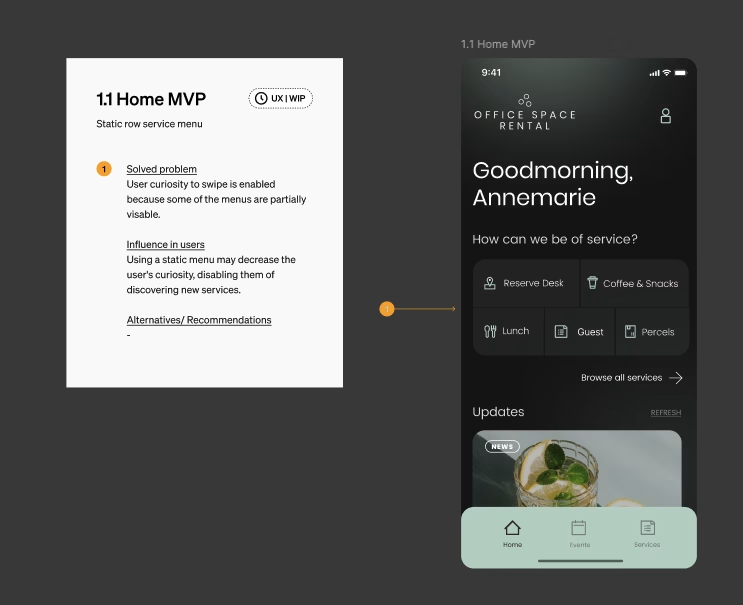
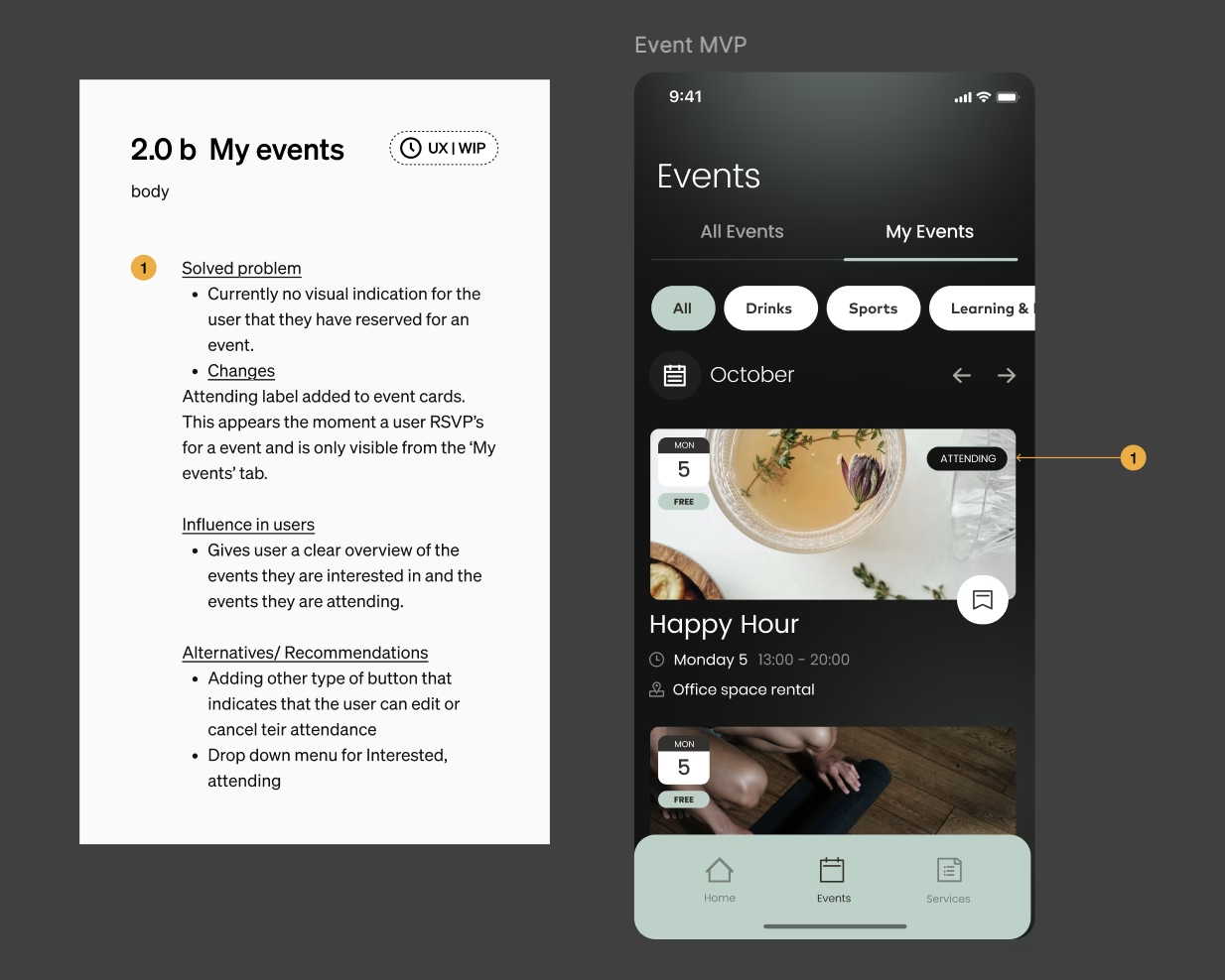
For every screen I documented detailed UX annotations explaining:
- What changed. - Why it changed. - Expected user behavior. - Functional requirements for development.
In parallel, I designed and refined flows including: - Login - Registration - Password Recovery - Delete Account - Logout - Food Ordering - Checkout - Event Favorites
I also contributed to building the interactive prototype of the complete MVP to validate that all necessary screens and interactions were included before development estimation.
The Result
The structured documentation accelerated collaboration between designers and developers while helping ensure that the MVP provided complete user journeys ready for implementation.
A significant number of the interfaces and interaction patterns I designed became part of the final prototype delivered to the client.
Throughout the project I worked in short iterative cycles with weekly design reviews alongside my mentor and the wider design team.
Feedback focused on: - Simplifying complex layouts. - Improving visual consistency. - Using reusable Figma components and variants. - Refining spacing and alignment. - Increasing button accessibility. - Writing clearer UX annotations.
Each iteration strengthened both the usability of the application and my own design process. Rather than viewing feedback as corrections, I used every review as an opportunity to improve both the product and my approach to interaction design.
Reflection
This project marked an important milestone in my development as a UX designer.
Working within a professional product team taught me how to balance user needs, business requirements, technical constraints, and stakeholder feedback while designing for an existing digital product.
One of the most valuable lessons was learning that successful redesigns are often driven by thoughtful refinements rather than radical changes. By carefully analyzing existing user journeys, validating improvements through continuous feedback, and documenting design decisions clearly, I was able to contribute concepts that were ultimately selected for implementation within the final MVP.